library(plant)

params <- scm_base_parameters("FF16")Patch dynamics
guide
This guide moves from one individual to a patch: an area in which many plants grow and compete for resources. You will run a one-species patch, follow its cohorts through time, inspect its light environment, and then add a second species.
Rather than simulating every plant separately, plant represents cohorts as nodes and follows their changing size and density. These trajectories are the characteristics of the model’s partial differential equation. See the size-structured PDE being solved and the characteristic method used to solve it.
Set up the patch
First we instantiate the basic parameters of the FF16 strategy. max_patch_lifetime is the oldest patch age integrated by the solver and also parameterises the default disturbance distribution. Its default is about 105 years; the corresponding mean disturbance interval is a separate derived value of 30 years.
One patch
Add one species, represented by an LMA value of 0.0825:
patch <- add_strategies(params, trait_matrix(0.0825, "lma"))Run the characteristic solver and collect the state after every recorded step:
result <- run_scm(patch, collect = TRUE)The result contains several components. These are the ones used most often:
names(result)[1] "steps" "n_spp"
[3] "species" "env"
[5] "offspring_production" "net_reproduction_ratios"
[7] "p" | Component | What it contains |
|---|---|
steps |
One row per recorded step, including patch age (time) and the abundance of patches of that age (patch_density). |
species |
One row per node per step, including height, density, and individual leaf area (competition_effect). |
env |
Resource conditions through time, including the light profile. |
offspring_production |
Reproductive output during patch development. |
net_reproduction_ratios |
Lifetime reproductive output for each species. |
p |
The parameters used for the run, including any refined schedule. |
The result also records n_spp, the number of species.
First reshape node heights into a matrix:
t <- result$steps$time
h <- t(sdd_matrix(dplyr::filter(result$species, species == "1"), "height"))
here h is the height of every node, arranged so that each row is a time and each column is a node:
dim(h)[1] 142 142The time points recorded by the solver are not evenly distributed:
sample_steps <- unique(round(seq(1, length(t), length.out = 5)))
signif(t[sample_steps], 1)
[1] 0e+00 3e-03 5e-01 4e+01 1e+02This uneven spacing is deliberate. Early patch development needs higher time resolution because small differences are amplified by competition. Although the patch runs for about 105 years, roughly half the recorded steps occur in the first year. See The node-spacing algorithm.
Nodes are introduced at each time-step, except the last. At time step \(i\), the rows of h record the height of all previously introduced nodes in the patch:
h[10, 1:10] [1] 0.3920954 0.3920902 0.3920850 0.3920798 0.3920746 0.3920694 0.3920642
[8] 0.3920589 0.3920537 0.3920458with NA for nodes that have not yet been introduced:
h[10, 11]10
NA Similarly, the \(j\)th column of h records the heights of a particular node:
h[10:19, 10] 10 11 12 13 14 15 16 17
0.3920458 0.3920537 0.3920617 0.3920696 0.3920776 0.3920935 0.3921094 0.3921253
18 19
0.3921412 0.3921571 with NA at time steps before it was introduced:
sum(is.na(h[, 10]))[1] 9With a single species on this schedule there is one more recorded time step than node introduction, with the last two steps having the same number of nodes. With multiple species there can be more time steps than node introductions, as we’ll record data at every node introduction for either species when their schedules differ.
FF16 individuals grow taller through time, but their growth rate depends on both their size and the light reaching their canopy. Competition therefore causes nodes introduced at different times to follow different trajectories.
We can plot the trajectories of nodes developing within a patch over time:
matplot(t, h, lty=1, col=util_colour_set_opacity("black", 0.25), type="l",
        las=1, xlab="Time (years)", ylab="Height (m)")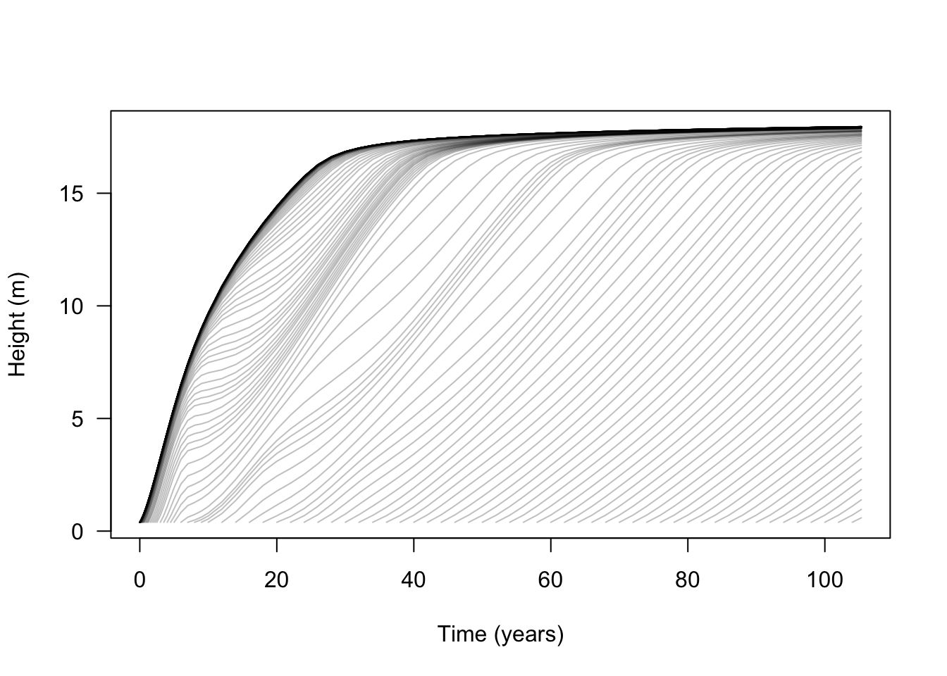
The light environment — canopy openness as a function of height — is stored over each time step; see Canopy & light-environment models for how it is computed from the leaf area above. This means we can also plot how it changes during patch development:
light <- result$env$light_availability

# Set limits
xlim <- c(0, 1.1)
ylim <- range(light$height)

# Draw the spline at each step
plot(NA, xlim=xlim, ylim=ylim, las=1, xlab="Canopy openness", ylab="Height (m)")
for (s in unique(light$step)) {
  x <- dplyr::filter(light, step == s)
  lines(x$light_availability, x$height, col = "grey")
}

# Add labels at specific times
blues <- c("#DEEBF7", "#C6DBEF", "#9ECAE1", "#6BAED6",
           "#4292C6", "#2171B5", "#08519C", "#08306B")

times <- c(5, 10, 20, 40, max(result$steps$time))
cols <- colorRampPalette(blues[-(1:2)])(length(times))

for (i in seq_along(times)) {
  s <- result$steps$step[which.min(abs(times[[i]] - result$steps$time))]
  x <- dplyr::filter(light, step == s)
  lines(x$light_availability, x$height, col=cols[[i]])

  y <- max(x$height)
  points(1, y, pch=19, col=cols[[i]])
  text(1 + strwidth("x"), y, paste(round(times[[i]]), "years"),
       adj=c(0, 0))
}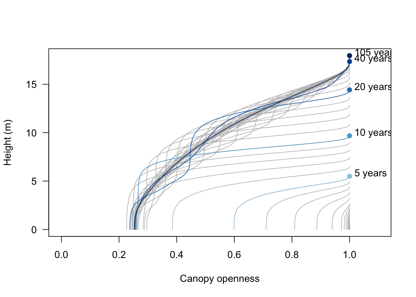
Initially, all nodes are short and most of the canopy is open. As the patch develops, only the tallest plants remain in high light. Shorter plants experience changing conditions as older plants die and new growth fills the gaps.
This is best shown by plotting the canopy openness at ground level over time:
ground <- light |>
  dplyr::group_by(time) |>
  dplyr::slice_min(height, n = 1, with_ties = FALSE) |>
  dplyr::ungroup()
plot(ground$time, ground$light_availability, type="l", las=1,
     ylim=c(0, 1), xlab="Time (years)", ylab="Canopy openness")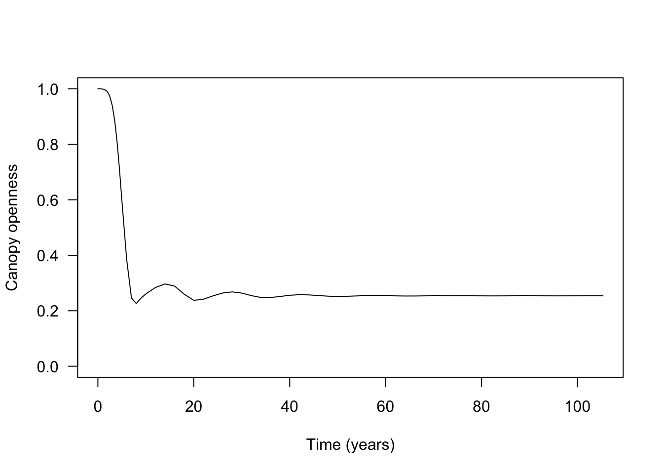
The repeated waves reflect recruitment followed by self-thinning. Mortality is not instantaneous, so a one-species patch can briefly recruit more plants than the closed canopy can support.
Leaf area index in one patch
Leaf area index (LAI) is total leaf area per unit ground area. The collected output records individual leaf area as competition_effect; weighting it by node density and integrating over height gives patch-level LAI. FF16 multiplies LAI by the light extinction coefficient k_I to obtain the ground-level optical depth used by its canopy model:
lai <- result$species |>
  dplyr::filter(species == "1") |>
  dplyr::group_by(time) |>
  dplyr::summarise(
    lai = patch_lai(height, density, competition_effect),
    .groups = "drop"
  )
plot(lai$time, lai$lai, type="l", las=1, xlab="Time (years)", ylab="Leaf area index")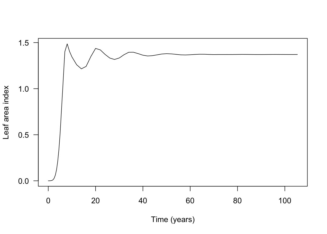
Multi-species patches
Now add a second species with higher leaf mass per area (LMA). Both species use the same light environment, so each changes the conditions experienced by the other:
patch_2sp <- add_strategies(patch, trait_matrix(0.2625, "lma"))Then collect the patch-level dynamics:
result_2sp <- run_scm(patch_2sp, collect = TRUE)We can plot the development of each species within the patch:
t2 <- result_2sp$steps$time
h1 <- t(sdd_matrix(dplyr::filter(result_2sp$species, species == "1"), "height"))
h2 <- t(sdd_matrix(dplyr::filter(result_2sp$species, species == "2"), "height"))

cols <- c("#e34a33", "#045a8d")

# Species 1 - red
matplot(t2, h1, lty=1, col=util_colour_set_opacity(cols[[1]], .25), type="l",
        las=1, xlab="Time (years)", ylab="Height (m)")

# Species 2 - blue
matlines(t2, h2, lty=1, col=util_colour_set_opacity(cols[[2]], .25))
To isolate the effect of the competitor, compare the low-LMA species alone (black) with the same species in the two-species patch (red):
# Monoculture patch (black)
matplot(t, h, lty=1, col=util_colour_set_opacity("black", .25), type="l",
        las=1, xlab="Time (years)", ylab="Height (m)")

# Two species patch (red)
matlines(t2, h1, lty=1, col=util_colour_set_opacity(cols[[1]], .25))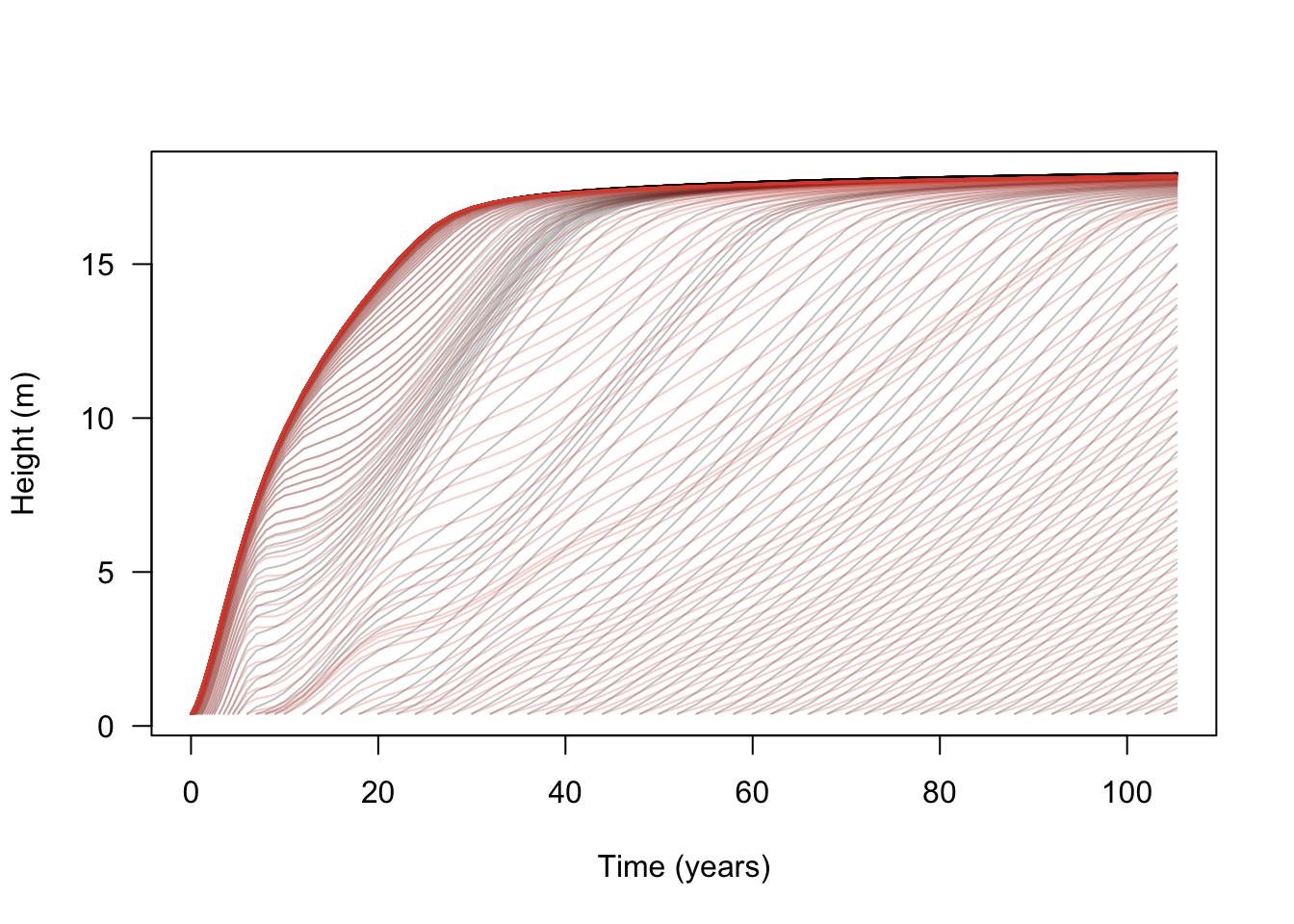
The additional species has little effect on the initial wave because it grows more slowly and remains shorter. After canopy closure, around year 5 in this example, later recruits face stronger competition and are slowed, suppressed, or eliminated.
The dynamics are easier to see when node trajectories are weighted by node density (some of the lines here represent nodes at close to zero density). Log density is available as a characteristic variable of all plant strategies:
# Relativise the log densities onto (-4, max)
d1 <- t(sdd_matrix(dplyr::filter(result_2sp$species, species == "1"), "log_density"))
d2 <- t(sdd_matrix(dplyr::filter(result_2sp$species, species == "2"), "log_density"))
rel <- function(x, xmin) {
  x[x < xmin] <- xmin
  xmax <- max(x, na.rm=TRUE)
  (x - xmin) / (xmax - xmin)
}
rd1 <- rel(d1, -4)
rd2 <- rel(d2, -4)

# R doesn't seem to offer a way to plot lines that vary in colour, so
# this is quite roundabout using `segments`, shaded by the density at
# the first part of the line segment:
n <- length(t2)
x <- matrix(rep(t2, ncol(h1)), nrow(h1))
col1 <- matrix(util_colour_set_opacity(cols[[1]], rd1), nrow(d1))
col2 <- matrix(util_colour_set_opacity(cols[[2]], rd2), nrow(d2))
plot(NA, xlim=range(t2), ylim=range(h1, na.rm=TRUE),
     las=1, xlab="Time (years)", ylab="Node height (m)")
segments(x[-1, ], h2[-1, ], x[-n, ], h2[-n, ], col=col2[-n, ], lend="butt")
segments(x[-1, ], h1[-1, ], x[-n, ], h1[-n, ], col=col1[-n, ], lend="butt")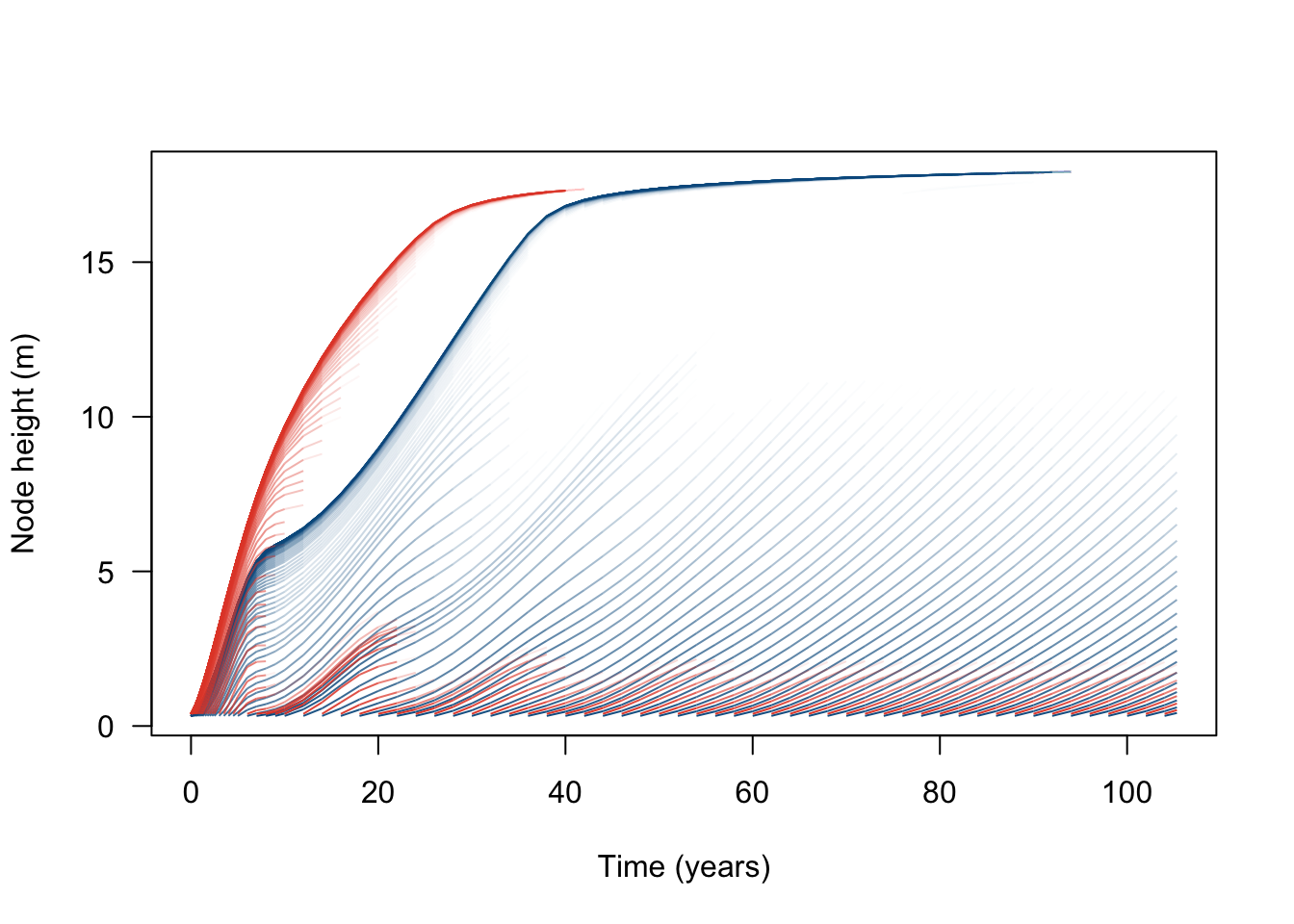
Now we see that the high LMA species (blue) becomes dominant, excluding the low LMA species (red) from the canopy.
The changing intensity of competition can be shown as the total leaf area of each species:
lai2 <- result_2sp$species |>
  dplyr::group_by(species, step) |>
  dplyr::summarise(
    lai = patch_lai(height, density, competition_effect),
    .groups = "drop"
  ) |>
  tidyr::pivot_wider(names_from = species, values_from = lai,
                     names_prefix = "sp", values_fill = 0) |>
  dplyr::right_join(result_2sp$steps, by = "step") |>
  dplyr::arrange(step) |>
  dplyr::mutate(dplyr::across(c(sp1, sp2), ~tidyr::replace_na(.x, 0)),
                total = sp1 + sp2)

# Patch total LAI (dashed)
plot(lai2$time, lai2$total, type="l", las=1, lty=2,
     xlab="Time (years)", ylab="Leaf area index")

# Species 1 LAI (red)
lines(lai2$time, lai2$sp1, col=cols[[1]])

# Species 2 LAI (blue)
lines(lai2$time, lai2$sp2, col=cols[[2]])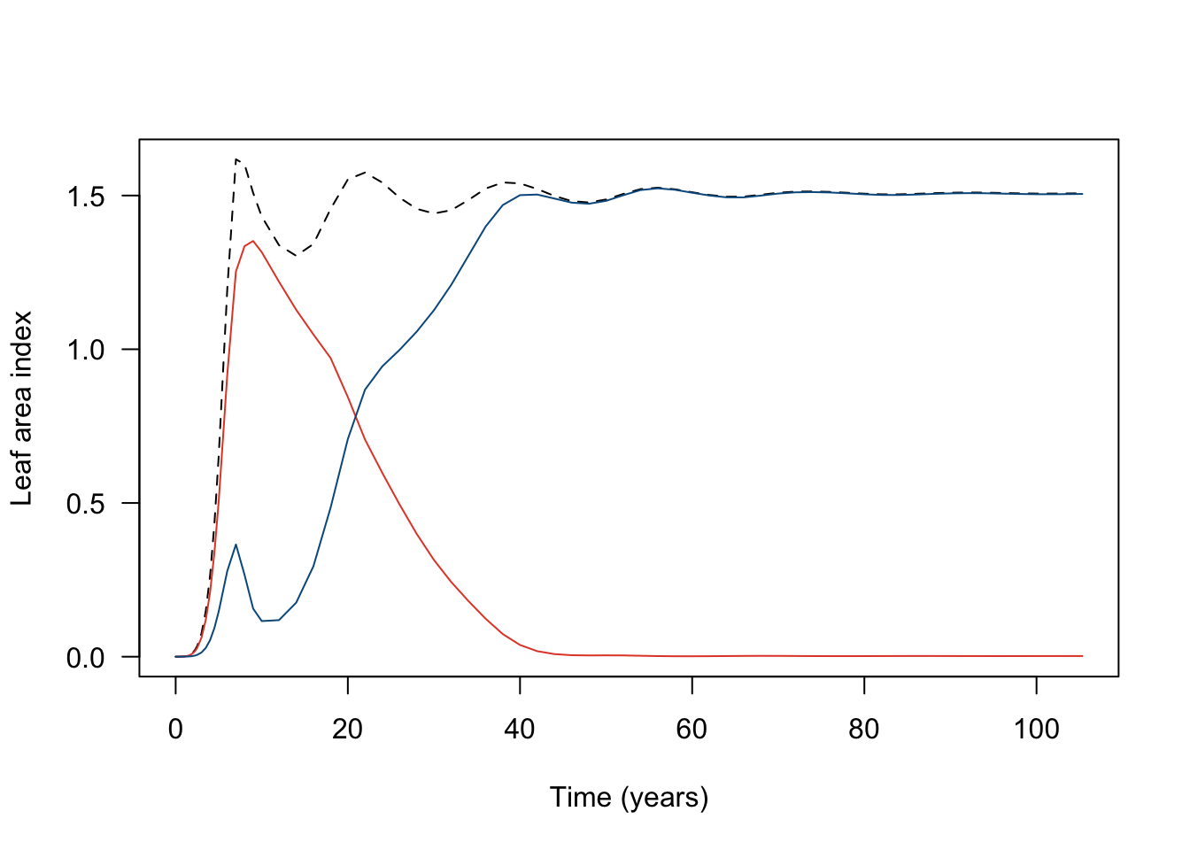
Appendix - ggplot example
#' A standard plot for density weighted node trajectories
#'
#' Parameters:
#'  - result: the output of `run_scm(..., collect = TRUE)`
#'  - threshold: lower bound on density
#'
#' Requires:
#'  - ggplot2
#'  - dplyr

patch <- function(result, threshold = 1e-3) {

  # The `species` table is already in long format, with one row per node
  # per step, so we can filter and plot it directly.
  df <- result$species |>
    dplyr::filter(species == "1", density > threshold)

  # Plot with densities
  ggplot(df, aes(x = time, y = height,
                 group = node, alpha = density)) +
    geom_line() +
    labs(x = "Time (years)",
         y = "Height (m)",
         alpha = "Density") +
    theme_bw()
}